Project Overview
A platform to help ADHD teens being medication adherence by providing them engaging ways to self-manage their symptom and be able to make suggestion with their families & caregivers
My Role
UX Designer
Timeline
3 months
Context
Team
3 Designer, 2 Cognizant Experts
Tool
Miro, Figma, Adobe Creative Suite, Protopie
This project is the output of ID-6212-1 Graduate Studio 2 Health&Wellness and is sponsored by Cognizant. It’s tutored by Professor Wendell Gordon Wilson. The aim of the project is to design an digital product dealing with medication adherence for people dealing with chronic disease
Background - Why ADHD teens?
ADHD is one of the most common neurodevelopment disorders of childhood, affecting 4.4% of the US adult population. Studies have documented that medication non-adherence is common in childhood/adolescent ADHD, the prevalence of medication discontinuation or non-adherence is between 13.2% to 64%.
Problem⁉️
Non adherence to medication for teens with ADHD is one of the most challenging factors for their parents and themselves, it poses multiple consequences such as symptom persistence and reducing academic success

Outcome 🔑
We created an app that provides an emotional support - Dr. Messy, to better managing kids medicine taking, hyperactivity tracking, and daily-well being checking, so as to provide teens with more opportunities to make more voice during the medication transaction period and be able to better communicate with caregivers
02. A Hyperactivity track to evaluate medicine
Problem
❌ No quantitative data but mere self report to evaluate medicine effectiveness
❌ Users don’t know whether the medicine is effective or not
Solution
✅ Measure hyperactivity data through the smart pen when users are writing
This feature would remind users to track hyperactivity by completing their homework During the writing, the system would monitor users’ hyperactivity through measuring completed time and formulate accessible report for users to understand the effectiveness of medicine.
01. Medicine intake monitoring with Dr. Messy
Problem
❌ Users forget about taking medicine
❌ Users don’t know the side effect and condierrations when taking medicine
Solution
✅ Automatically update medicine intake frequency with notification
Reminding users to take medicine at the time set by users. More than that, Dr. Messy would support users along the way to answer any related information about the medicine
03. Daily well-being Check-in with Dr. Messy
Problem
❌ Delay in experiencing side effects for too long before changing dose
Solution
✅ Talk with Dr. Messy to update daily well-being and keep aware of side effects
Inviting users to talk with Dr. Messy at a daily basis for both emotional support and functional purpose. Teenagers can better know how to verbalize their symptoms and thus communicate with doctors.
04. Data tracking and synthesis
Problem
❌ Don’t how to make suggestions about changing dose without evidence
Solution
✅ Track hyperactivity data and synthesize daily check-in to an accessible report
This feature would allow teenagers to better understand their hyperactivity level and responses to the newly transited medicine by providing accessible data and report such that they can have more voice when communicating with doctors and parents.
…How did we get there🚀…
Generative Research - Interview with parents, doctors, and ADHD kids
To target a specific problem scope, we conducted primary user research with different stakeholders in the entire ecosystem of 3 parents, 2 doctors and 3 teens. Our goal is to narrow down the problem scope by understanding their painpoints, needs, and expectation regards to medication adherence from different perspective, teen’s ADHD related daily life, their thoughts about ADHD and medicine intake in general, and their interaction with different stakeholders (parents, caregivers, peers) and also her challenges and pain points encountered
3 parents of ADHD kids
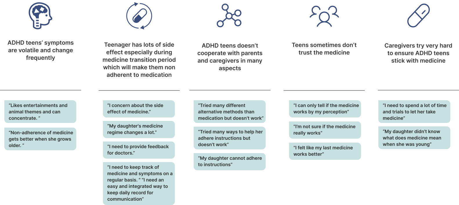
Affinity Mapping
After conducting the interview, we organized the interview data through affinity map analysis. With this bottom up process, we grouped up five main themes as research insights.
Key findings from interviews
Competitive Analysis
2 ADHD doctors
3 ADHD kids
5 key insights on the participants’ behavior related to medication adherence are gathered from affinity mapping
Since problem of medication adherence among teenagers with ADHD has been identified, and also, one parents mentioned apps they are using right now are missing feature and have bad user experience, thus we would also like to see what are the current product for ADHD in the market, we went through some digital solutions in the market.
Insight from competitive analysis
User Journey Map
We synthesized and condensed insights to a user journey map which described a very common circle of switching medicine that teens may experience during their medical treatment.
The entire user journey would last from 3 to 6 month, starting from the point of diagnosis, getting used to the medicine, experiencing side effects, adjust to a optimal status for a while, and finally need to switch medicine again due to loss of effect or other side effects. During these different stages, we found that teenagers feel the worst when they are experiencing persistent side effects from after switching the medicine. Besides from physical reaction, they also face difficulties of communicating with doctors about the doses due to both their lack of voice and communication gaps from policy (e.g. parents can only reach out to doctors at certain times). This user journeye empowerment during stakeholder communication.
Refined Problem Statement 🧐🧐🧐
The ADHD medical treatment for teens is a changeable and ongoing process. During each medicine transition period, teens will experience a lot of struggles that prevents them from adhering with medicine. How might we design a product that support ADHD teenagers by empowering them with more voice during treatment especially during transition period?
Design Objectives 🎯
1️⃣ To design to voice teen’s opinion in the medication process.
2️⃣ To make teenagers independent in the medication.
3️⃣ To create a platform where all stakeholders including teen, parent and doctors could share information.
4️⃣ To create awareness about medication in teenager about medication.
Brainstorming
Step #1 - Our first step is to brainstorm as much ideas as possible, we came up with 150+ ideas in total at first based on the objectives and insights from previous stages. We created a thumbnail sketches for each idea.
Step #2 - Our next step is to screen ideas generated from the brainstorming, the screening process is based on 4 benchmarks, each benchmark has different total scores considered as different priority while evaluating the ideas, then we screened out initial 150+ ideas into 28 ideas with high grades
Step #3 - Next, we categorized them into different design themes and utilized morphological matrix to cluster ideas into 6 design concept, then we voted 3 final concepts based on the previous insights and contraints
Selected three concepts
Concepts feedback from Cognizant
We invited digital experience team from Cognizant to evaluate the feasibility and effectiveness of our initial concepts. After discussion, we agreed that the pain points are it’s particularly difficult for children being medication adherence during medicine transition period, and making children being independent during medication to make more voice is something we should focus on, therefore we decided to move forward with combining concept 3 + concept 2 as our final concept
Refined core features
Then we leveraged our final concepts platform with virtual assistant and smart pen to support teens through medicine transition period with hyperactivity tracking, effective reminder, and daily symptom check, the refined core feature is identify below
After determing the main feature, we created a information architecture of the App and presented to stakeholders and Cognizants
Based on the core features we identified, we generate wireframes to illustrate our concepts and the refined user flow
Information Architecture
Wireframes
Feedback from stakeholders
Before jumping into high-fi design, we conducted interviews with 3 prior participants and 2 experience team people from Cognizant to assess the utility and potential impact of our concept, the details are also explained as below
Key changes
User Testing & Iteration
Home page
Medicine Taking
Report Generate
We conducted four usability testing with our 1st round refined prototype with three one ADHD teenager and three fellow UX designers, we prompt the the tasks like completing the daily check, try to doing the homework to activate hyperactivity tracking, and try to ask some information about the medicine. Based on both qualitative data and quantitative data, we gather some insights for our further iterations
Taking with Dr. Messy
Hyperactivity Tracking

Dr. Messy Development
Dr. Messy represents ADHD teens. The mess that they are going in their life, due to hyperfocus and and hyperactivity in represented in Dr. Messy. We created Dr. Messy by scribbling in round shape and evolved it to mess in a neat doctor’s coat.
Design system
I opted teal and sky as the primary color to create a calm but dynamic atmosphere for teenager medication adherence. The selection of the color red was deliberate, aimed at infusing the app with a sense of warmth and motivation. Furthermore, I adopted a flat design philosophy to maintain a clean and minimalist aesthetic for the app.
Final Design
Reflection & Future work
Always validate the decision 🔍
Cognizant initially tasked us with addressing medication adherence issues among teenagers, without specifying a particular medical condition. To confirm the existence of this problem, we conducted preliminary semi-structured interviews with stakeholders of patients with type 1 diabetes, asthma, and ADHD. Based on their insights, we decided to focus on ADHD due to the confirmed presence of medication adherence challenges in this context, as the result, this approach is highly valued by Cognizant
Accommodate accessibility consideration into research process 🧐
Designing for focused group that is suffering with a chronic disease is a challenge in itself. And designing for teenagers adds on to the challenge, since the teens are vulnerable group of individuals. We took the ethical and accessibility consideration into account during the semi-structure user interview, by leveraging respectful and responsible manner, ensuring their voices are heard while prioritizing their well-being.
Conduct user testing directly with more ADHD teens 👦
Due to the time and resources limitation, we only conducted one user test directly with ADHD teens (three others are with fellow UX designers), for the next step, we would love to conduct more user testing directly with ADHD teens to uncover more usability & utility problem within the product.


